We began with listening. Through a series of in-depth interviews and workshops with staff, commissioners and board members, we explored how the organisation was perceived internally, within government, and by the public it exists to serve.
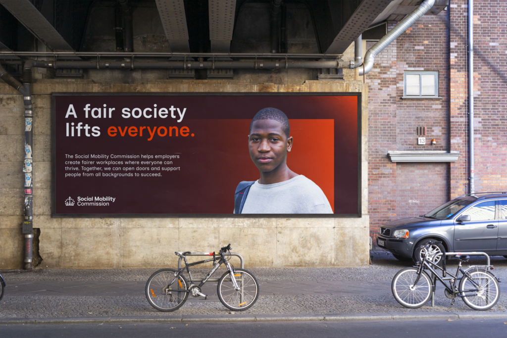
This process revealed a tension at the heart of the brand: the need to balance credibility and authority with warmth and humanity. The Commission’s voice had to be confident enough to challenge policy and still compassionate enough to connect with people’s lived experience.
From these insights, a new narrative began to take shape, one that championed movement, ambition and progress. A story that redefined the Commission’s role not as a critic on the sidelines, but as an active force helping society move upward, together.
This narrative informed the development of a refreshed internal tone of voice: authoritative yet empathetic, clear yet inspiring. It gave the Commission the language to speak with purpose and authenticity across every channel.

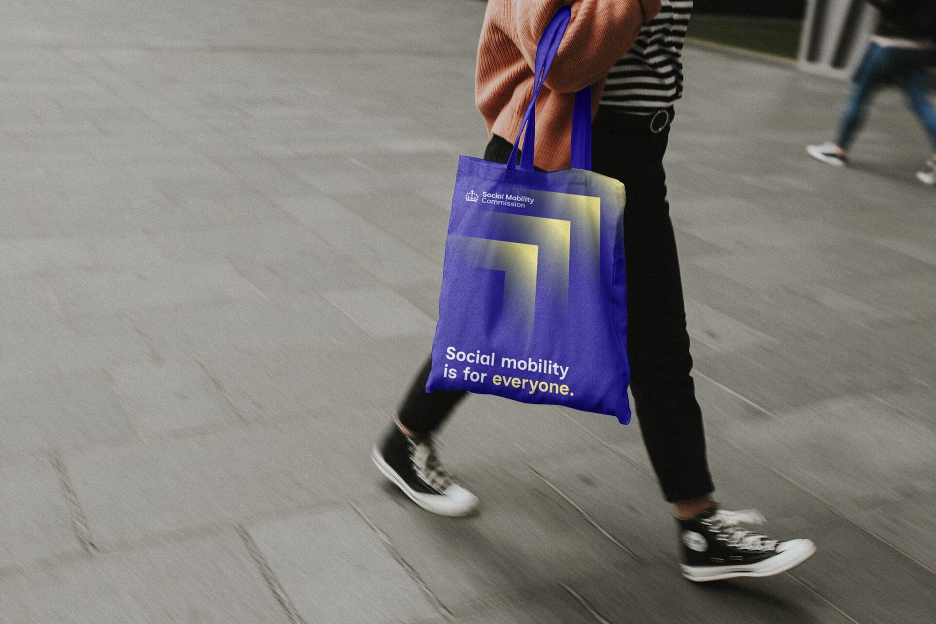
Visually, the brand is built on a single, uplifting idea: upward motion through society. The new graphic language draws inspiration from the “greater than” symbol—transformed into a series of bold, rising arrows that capture the spirit of aspiration and advancement.
To preserve a sense of authority, the Crown remains at the heart of the identity—a mark of credibility that anchors the Commission within the ecosystem of government. But around it, everything is new:
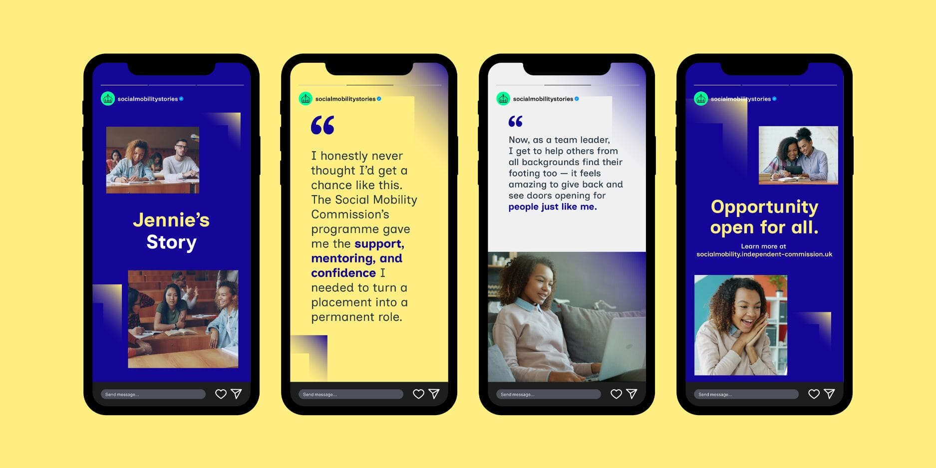
Each element was crafted to bring the Commission’s purpose to life: helping everyone, regardless of background, to rise.
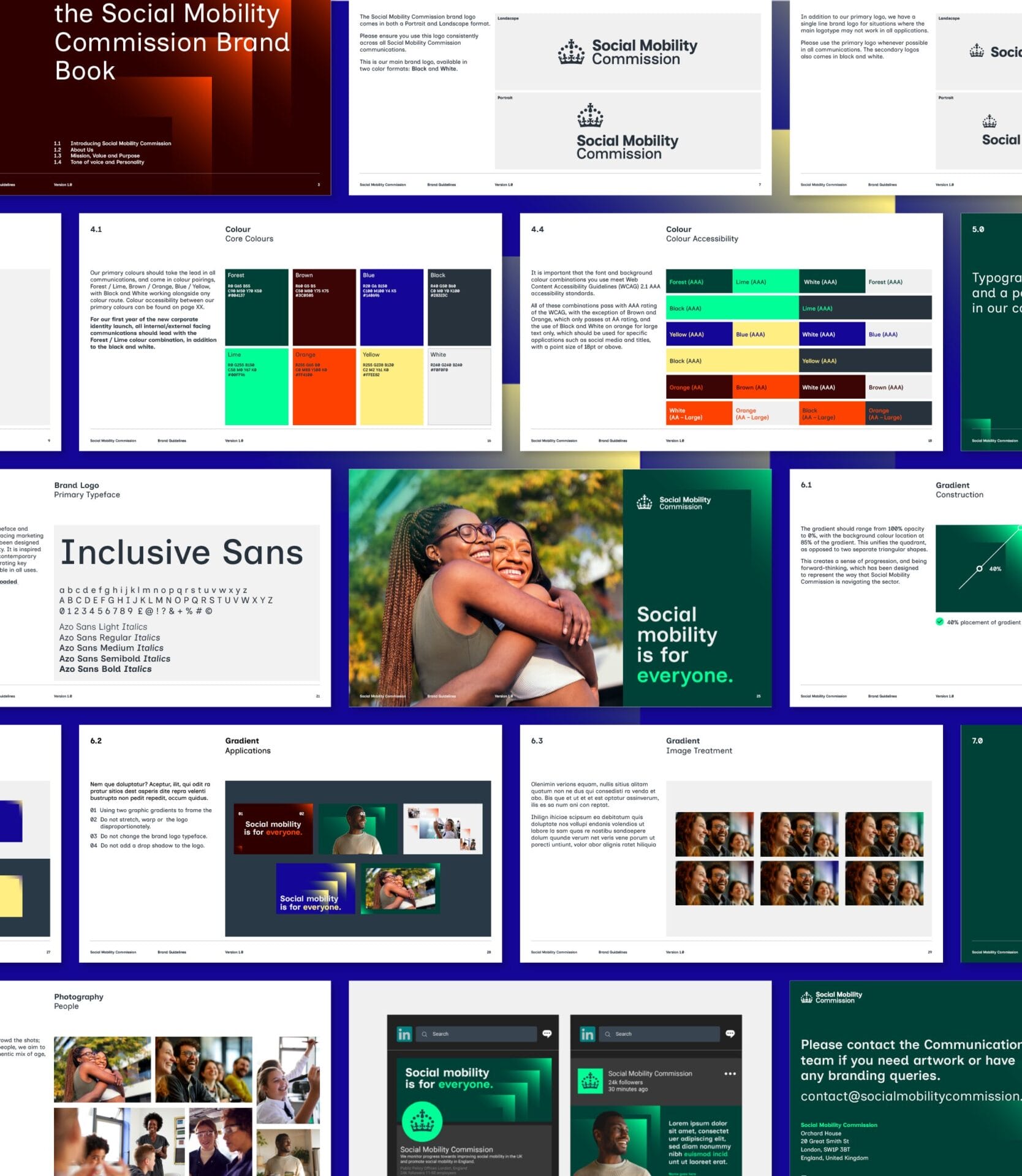
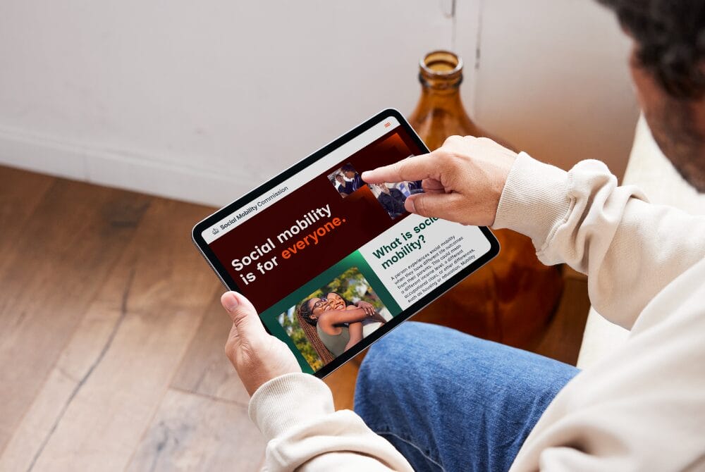
Visually, the new brand is built around a single, uplifting idea: upward motion through society.
The new graphic language draws inspiration from the greater than symbol, reimagined as a series of bold, rising arrows that embody progress and aspiration. The Crown remains at the heart of the identity, a proud reminder of the Commission’s authority and its connection to government. But everything surrounding it is new:
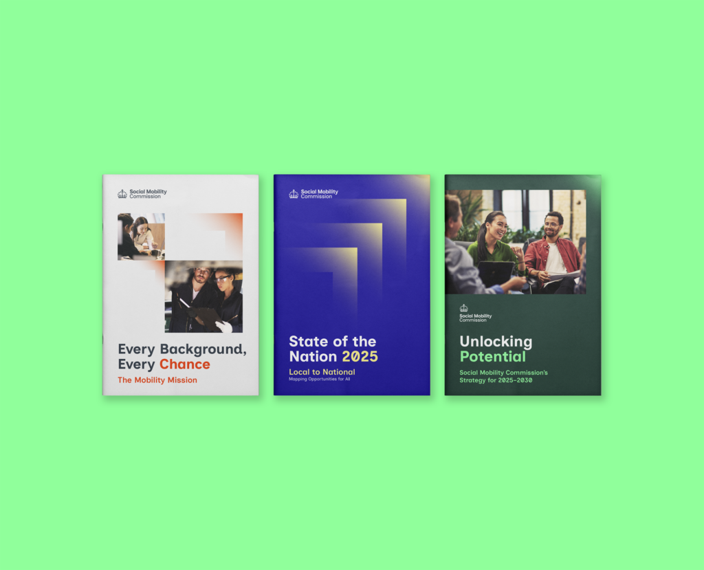
• A dynamic palette of optimistic, vibrant colours representing diversity and progress.
• A modern, humanist typeface designed for clarity, accessibility and warmth.
• A flexible design system that moves seamlessly across digital, print and social channels, ensuring consistency and pride in every expression.
The result is a confident, contemporary brand that embodies the Commission’s dual role, independent yet authoritative, institutional yet human.
More than a visual refresh, this was a renewal of purpose. A brand that captures the spirit of progress and possibility, and a Commission ready to make a fairer future not just imaginable, but achievable.