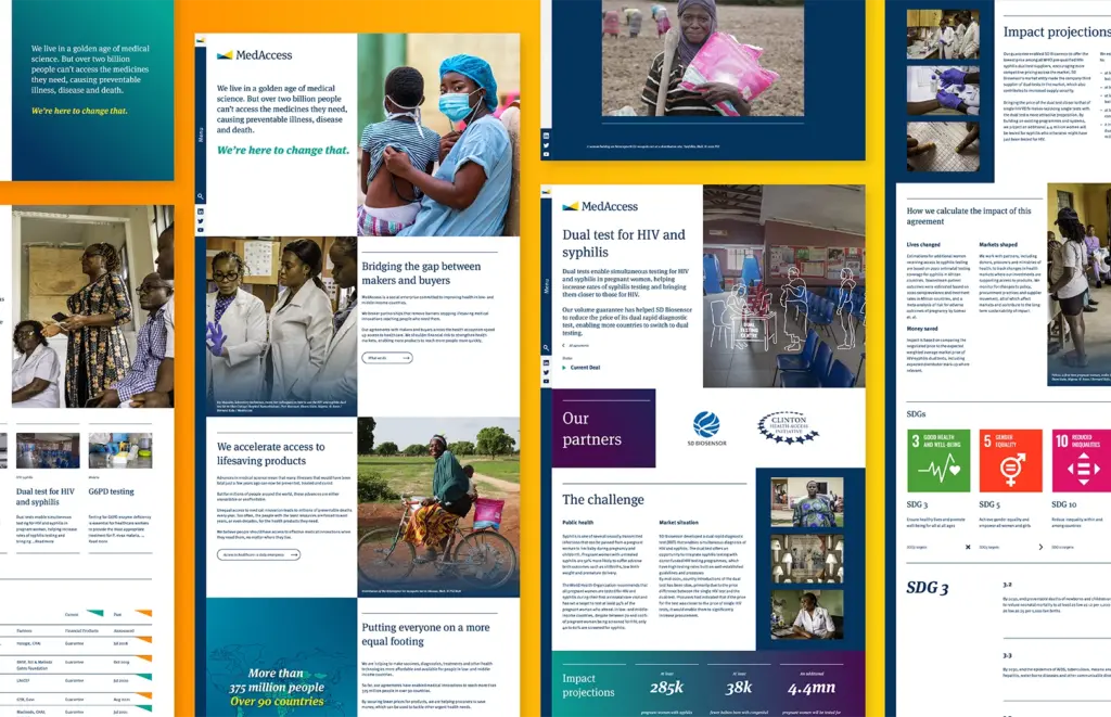


Recognising the breadth of the company’s stakeholder landscape – including global health, charity, finance and government – we carried out a comprehensive qualitive study of brand perceptions and opportunities. Building from this, we carried out a range of internal interviews, alongside a thorough competitor audit. Through a series of workshops, we worked with the MedAccess leadership to qualify and prioritise opportunities. This allowed us to draw out MedAccess’s unique strengths and opportunities and identify a powerful white space for the brand to own, both in terms of its written or spoken and verbal identity. The cornerstone to this, was the unique bridging role the brand played in the complex international health marketplace. From this, we developed a more engaging, purposeful brand positioning, with a unique visual identity.

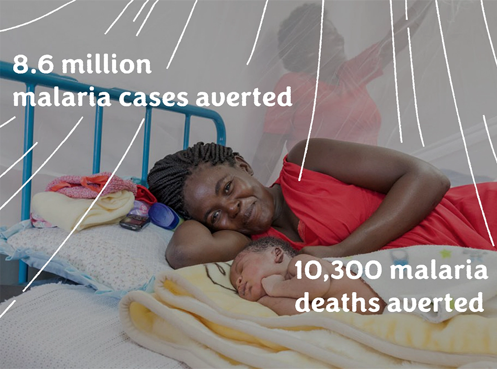
Components of the new positioning included truths, narrative, messaging, and a new tone of voice. Visually, we evolved their brand by building a more approachable and welcoming colour palette and developing an entirely bespoke illustration style. The new illustrations were successful in helping solve issues they had faced obtaining relevant photography, bringing a whole new level of meaning to their brand imagery and enabling them to visually communicate their impact for the first time.
“I’ve worked on branding projects many times in my life. By and large those experiences have been disappointing. This was the exact opposite. I was inspired.”
Michael Anderson, CEO, MedAccess